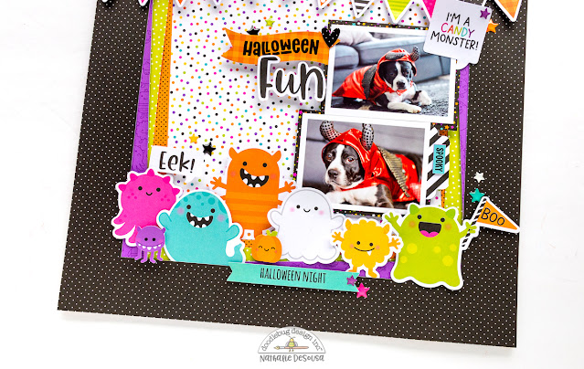
I wanted to take advantage of all those spooky cute monster pieces. This lead me to create a simple but fun design for the background of the page.
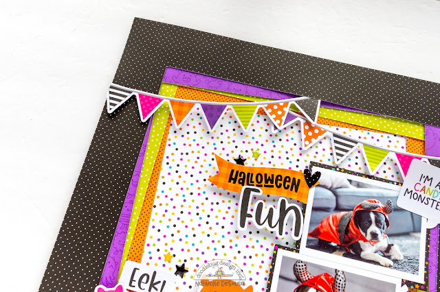
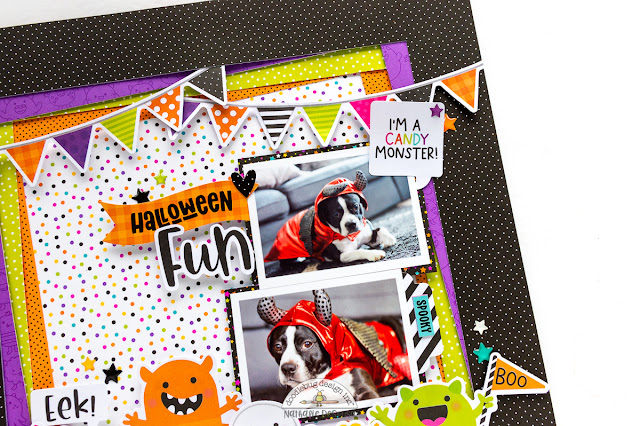
It all started with the Treat Yourself paper. It has all the collection colors in small polka dots. So, let's highlight some of the colors by creating moving frames. I simply cut a frame from a few of the collection papers, and attach them to the base using foam adhesive. Along the way, I slightly rotated some of them to add interest to the layered look of the background. I used the banner garland a top of the page to help me add a festive look to the page.
I backed my baby's photos with a paper from the 6x6 paper pad. Then added them to the right of the frame. I rapidly went through the Chit Chat package to pull the speech bubble and help me complete my title work.
Just love how easily this came together, and how frightfully adorable this spread is! I cannot wait to see what you will create with the new Monster Madness collection
XO
SUPPLIES:
MONSTER MADNESS collection


Fantastic card
ReplyDelete