Hi there!
Nathalie with you today with a new layout all about those warm cozy feelings Autumn brings along. I usually look forward to Nicole's emails with the new upcoming cut files, so when i saw the new Fall Foliage Background (coming soon to the shop) i just had to use it on a page.
I love Fall colors, so i wanted to highlight them on the page, as the background for the beautiful cut file.
To bring out the details of the cut, i chose to create my own background using VIcki Boutin's Pop Acrylic paints. I simply masked the cardstock and used a flat brush to create the ombre square on the page.
While the background dried i cut two Fall Foliage backgrounds ( to fit the colored square) from white cardstock, glued them together, and then glued them to the background. I made sure some of the leaves were not glued fully together, so that they create interest on the background.
The picture of my babies was converted to black and white and added at the bottom corner of the square. I used one Leafy Floral cut out to decorate the bottom of the picture along with a few phrase stickers. Then for the title, i used a combination of alphas and the word "Love" - this was created using the Love 1 cut file from kraft paper-.
I love how this turned out, the boldness of the background creates the perfect canvas for the cut file and makes everything on the page pop. Remember to check these JustNIck cut files and all the new files that are revealed each week.
Scrapbook Layout created for Scrapbook Nerd - I LOVE SUMMER -
Hi there!
Hope you all are enjoying your summer/winter!... Today's project is for Scrapbook Nerd, and it is all based on Summer, and its colors.
I started with some Vicki Boutin acrylic paint and gesso to create the colored triangle shape on the page. Once it dried, i used some gess and a Kaisercraft stencil to create the spinwheel/firework image on the backgroud. The background was finished with some gold ink droplets.
I took advantage of the shape of the background to create a large cluster of ephemera, chipboard stickers, and some paper layers along the vertical line of the picture. I used all the colors in the new Echo Park Good Day Sunshine collection to bring Summer to this picture of my daughter at the beach resort in Ecuador.
To accent the shape of the background, the page was trimmed about half an inch per side, and then glued to one of the papers of the collection. A small slit was created on the half point of the vertical side; the edges were turned in, as to reveal a bit of the background. The fold was then used to hung a banner that serves as the title of this page.
I love how this turned out. The colors and feel of the page are perfect for Summer, and the picture of my daughter.
Stop by Scrapbook Nerd to check all the materials used in this page, and remember that you can always contact me if you have any questions on how this came together.
Scrapbook Layout created for Scrapbook Nerd - SUMMER DAYS -
hi there!
It is time for a new project for Scrapbook Nerd. This week our focus is on the many free digital cut files the stores offers. So with summer in full swing here in Toronto, I chose to use an image from the "Let The Sunshine In" cut file to create the background of this page.
First I chose to only use the large circle image, so i sized it to fit on half the page. To have the cut our pop on the page, I chose to add some Vicki Boutin art crayons (watercolor) to the background of the page.
While the background dried, I backed the cut out using papers from Simple Stories' "Hello Summer" collection and a bit of foam adhesive to create a bit of dimension on the cut out.
Once the picture was added, I went ahead and used stickers and ephemera from the collection to frame the picture and add a visual triangle to the page.
To finish, I trimmed a bit of the layout, and added a strip of rainbow to the page, a few black ink drops, and lines of journal. LOVE how this turned out The colors are just perfect for the season, and the selfie of my kids and i wearing shades.
Remember to stop by Scrapbook Nerd to check all the free cut files available, and all the materials used in this page.
Nathalie with you today with the first challenge of the month. The new "Cypress" kits are so gorgeous, that i was inspired to create two projects using the same prompts in different formats. But before i show you what i created, let me share this week's challenge prompts:
Use a limited color palette
Add stitching (either hand, machine or faux stitching) to your project
Use digital elements (cut files, cut apart sheets, etc)
Here is the first of two projects created with these prompts:
This month's Cypress PL kit is packed with CTK exclusives, and totally sublime designs and colors, plus the Scrapbook kit includes a Traveler's Notebook Insert which is the one i am using for this page. My choice was to use all things pink (or that had pink) in this layout.
I chose to layer some of the printable digital PL cards behind the picture. I love having the option of sizing the cards to fit into my projects, plus I can easily print them on copy paper which helps to reduce the bulkiness of the pages.
To balance the picture, I created a large cluster of elements from the June 2018 cut apart sheet. I added a bit of journaling to one of the pieces, and then just layered more cut outs around it. I used very little tape on this page, as i chose to secure most of the layout using some sewing machine stitching.
Love how easy it was to put this together following this week's prompts. But now, let me show you the second project created with the same prompts.
The inspiration for this page was the acrylic pieces that are included in the Cypress Scrapbook kit, the color of the acrylic was the inspiration for this layout's cooler palette. The teal/ light blue color in the background (created using this month's Mixed Media add on) provides the perfect canvas for the picture and embellishments.
This month's digitals are amazing, from cut files to the cut apart sheet, so i took advantage of the Doodle Heart cut file to create this layering die cut, and then pulled all the pieces from the cut apart sheet that followed the color palette, and used them to embellish the page.
Once again, I chose to secure some of the pieces (cut out and map) to the page using a bit of machine stitching. The texture it adds to the page is lovely, but also i chose to leave a large tail behind each stitching line, so that it adds to the movement of the page - think of it as water waves-.
Now it is your turn to use this three prompts to create projects of your own. Remember to tag Citrus Twist Kits (use the handle @citrustwistkits or hashtag #citrustwistkits) when sharing your projects on social media. You can also share your finish projects in the Citrus Twist Kits Friends page on Facebook.
I cannot wait to see how you use these prompts, and all the projects created with this month's Cypress kits. Remember I am always a comment away of you have questions on how any of the projects came together.
Scrapbook Layout created for Just Nick Studio - LOVE STORY -
Hello there!
Let me in on a little secret, today is my 18th wedding anniversary. At first I was considering documenting one of our wedding pictures, but i thought that will not show the real us, so instead i picked one of out attempts at a decent selfie to tell the story of the past 18 years.
To create this page, I chose to use the title as the focal point of the page. So I chose to enlarge to fit pretty much 2/3 of the page.
I chose the "Love" design from the WORD 4 cut file, and sized it to fit across the entire page.
The "Story" design from the WORD 3 cut file was then welded under the last two letters of Love, and then sent to the machine to cut. I used a pair of scissors to trim the intersecting parts of the "L" and "V" from the O, and backed it with one of our latest selfies.
The rest of the letters were backed with papers from Fancy Pants Design's The Bright Side collection. Before gluing it to one of the papers of the collection, I added a bit of Vicki Boutin art crayon to the background, so that all the details of the cut out will show nicely.
To finish a few embellishments were added to the page, so that the picture is framed nicely with them. A few lines of journal complete the page.
I love how this turned out (I am a fan of large titles -one of my favorite designs!!), and how easy it was to put together using the beautiful and versatile JustNick Studio cut files.
Stop by the Just Nick Studio store to check these and the rest of their beautiful designs.
Have a lovely day!
Scrapbook Layout created for Vicki Boutin DT - HELLO SPRING -
Hi there!Nathalie with you today to bring you a bit of
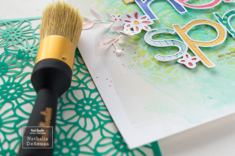
Spring on a page using the always fun Vicki Boutin mixed media and All The Good
Things collection, and a few cut files fromJust Nick Studio (which I happen to also be part of their DT)
Now, let me start by saying
that this layout took a few days to put together, and it changed along the way (I
was very sick at the time and heavy doses of medication happen during
filming).So it took a while to go
through the footage to see what I created – no joke!!!-.
It all started with a gessoed
foundation paper.Next I combined Iced
Daiquiri and Blue Hawaiian acrylic paints and water-so that the paint took the
consistency of watercolor- and used a brayer to create a watercolor look on the
background of the page.
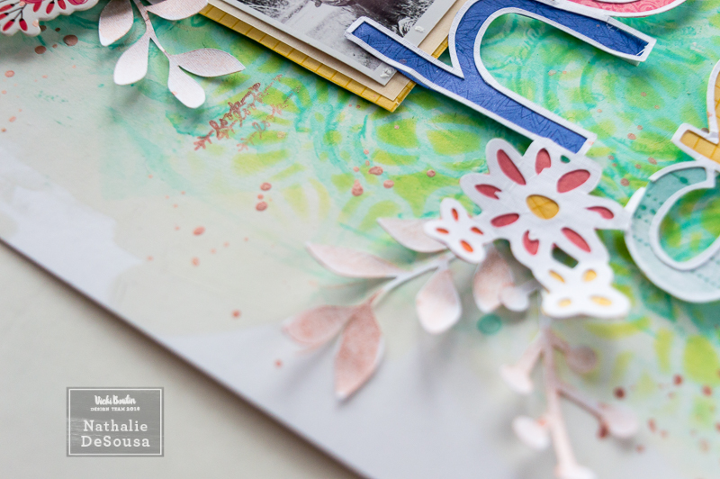
I added a few splatters of the
paint on the page, and then used a baby wipe to dry them up.The end result was that of small little
bleached droplets in the paper.Totally
loving this!
Next, I used one of Vicki’s
latest stencil releases (Scribbled Circles) to create a bit of texture and
interest on the background. The same paint that was used on the background was
added using a water brush on top of a stencil, and then a baby wipe was used to
clean a bit of the excess paint thus achieving the stenciled look on the page.
I let the background dry for a
bit, and worked on backing the Hello Spring cut file from Just Nick studio with
a rainbow of colors from Vicki’s All the Good Things collection.At the same time I used some of the papers to
add a few simple layers behind the picture.
Once the background was dry, I
wanted to add more interest to the background, and worked on a layered
effect.To add more to the floral motifs
at the corner of the cut out, I pulled the flower stencil from Vicki’s latest
release, and used different shades of yellow and green crayons to add this
layer on the background.
It is so simple to obtain this
‘inked’ look on the page by simply using Vicki’s Stencil brushes, a craft mat,
her Art Crayons, and a stencil.Simply
scribble some crayon on a craft mat, and then use the stencil brush to pick up
the pigment from the mat, and transfer it to the page –on top of the stencil-
in a circular motion.This time, I chose
to lightly rub the stencil crayon with a baby wipe to activate the pigment in
the page, thus creating a more vibrant look to the flowers.
Then using some foam adhesive
both picture and title was added to the page.The contrast in colors and textures just pops everything nicely on the
page.
Now it was time to embellish,
which meant adding to the floral motif on the title.So I chose to add a few paper clips (just cut
the clip part) as part of clusters at the corners of the picture.A few stem cut outs, created using Just Nick
Studio “Stems 4” cut file, were also added to the clusters and to each flower
motif on the title.
To add a bit more color, and
shine on the page, a bit of rose gold glaze was diluted with some water, and
used to color the cut out stems in the clusters.Also a few drops of the paint were then
added to complete the page.
After a few lines of journal
and some stamped sentiments (using Vicki’s rotary stamp, and rose gold glaze)
the page was finished.
Just love all the layers of
Vicki Magic on the background!They are
the perfect backdrop for the colorful title of this page.You can see more of how this page came
together in the following video:
That is all for me!I hope you try some of the techniques in
this page, and also come join us in the Vicki Boutin Mixed Media community on
Facebook.There is so much inspiration
and fun happening there!
Till next time!
Materials Used:
All The Good Things Collection:
12x12 paper pad,
7x10 paper pad,
Finishing Embellishments
On the Edge Embellishments
Watercolor Stickers
Rotary stamp
Mixed Media collection:
Foundation Paper
Gesso
Rose Gold CreativFX glaze
Water brushes
Art Crayon – Cool, warm and neutral sets
Stencil set – scribbled circles and flowers
Mister bottle
Acrylic pop Paints in Iced Daiquiri and Blue Hawaiian
Scrapbook Layout created for Vicki Boutin DT - 1, 2, 3, JUMP! -
Hello everyone!
Nathalie with you today with probably one of my most
favorite layouts ever!!!First of all,
I got to use a picture of my son, a cooler color palette, and lots of Vicki’s
All The Good Things goodies and mediums in a fun way.
I don’t know about you, but I find that when I start a
layout with no plan, it comes out better than when I start with an idea.The only thing I knew when I started this
layout was that I wanted to use pictures of my son (YAY!I used 2 pictures!!
It all started with a gessoed foundation paper (I have
a few prepped ahead of time, always) and some art crayons.I chose a very masculine palette, and started
working with the yellow art crayon, some water and the kissing technique.Next came the blue, and then the teal
crayon.I made sure to block the
background to one of the corners of the paper, and then added just a small
amount to the opposite corner.
Here is where my artsy side took over, and I started
to play with the mediums.So I pulled
the circle stamp set, and the color wheels and started stamping random circles
with matching color ink on top of the watercolor background
Since I chose the smaller circles, then I was able to
use the scribbled circle stampto stamp it around theprevious stamped circles (even on top of some
of them) using black and dark grey archival ink – I wanted to make sure that
the ink will not bleed when adding water-
When I saw all the scribbled circles, I thought about
adding more pigment to the center of each of them (and work shading into them,
too!), so I used some art crayon to scribble inside the lines.
I used my finger to diffuse the color inside the
circle.At times, I used a baby wipe to
moisten the pigment and make it more vibrant.I worked this into pretty much all the circles in the background.
As much as I loved the background, I wanted to add a
bit of texture.So I chose to mix some iridescent
glaze with some of the black watercolor pigment. NO WATER was added, I wanted a
thick paste.I pulled an old Heidi Swapp
stencil of small circles, and using a palette knife just scraped some paste to
the background.Just love how this all
turned out
Now it was time to assemble the page.First I really wanted to pop the pictures,
so I knew that I had to make the yellow prominent, so that it will contrast and
complement the blue in the picture. So I chose to trim the page about half an
inch around the corner where the background had been created, and stitched it
to the b side of the Shine Brightly paper, leaving the small watercolor paper free.
I used the 7x10 paper pad to create layers behind the
pictures, and then added a few ephemera pieces, and watercolor stickers as
extra layers behind the picture.
A bit of foam adhesive was added to one of the
pictures so that there is dimension, and to create a separation between them.
Then I used the foam sticker words to create the title
of the page.I placed the numbers 1 and
2 on the pictures, and then added the ‘3’ to the small watercolor corner,
followed by the word “JUMP!” using the chipboard thickers.To complement the circle motive of the page,
I glued a circle ephemera piece as a layer between the cardstock and paper at
the non-stitched corner.
A few lines of journal, and then some black watercolor
droplets complete this page.Truly one
of my favorite pages ever created.
Stylized picture of the layout
The following video will show you how this page came
together, though it sounds complicated, it isn’t.So sit back and enjoy!
I hope this inspire you to create a page of your
own.The secret to mixed media is to
have fun and experiment (trust me I have made notes in my little Junque Journal
on how I created this page!)
Remember to check all of Vicki’s mediums and her All
The Good Things collection,I cannot
emphasize enough how fantastic her entire line is!