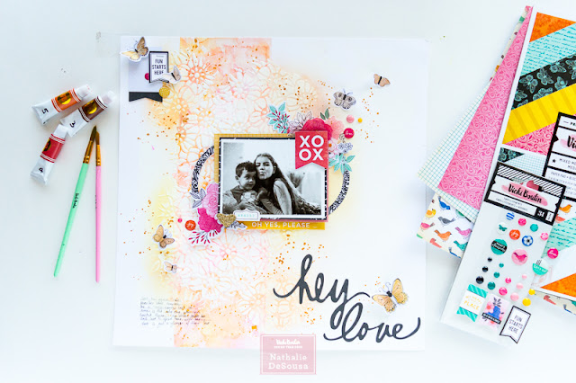
Scrapbook Layout created for Vicki Boutin DT - HEY LOVE -
Hello Everyone!
Nathalie with you to bring you a bit of inspiration using some
of Vicki’s beautiful products.
Everything is blooming around my place, so I wanted to add lots of those white blossoms I see on the trees to
a layout, so I decided to experiment with some watercolor, gesso and art
crayons.
It all started with a
gessoed foundation paper; my idea was
to have a column of watercolor as an anchor for this page, so I used some
painter’s tape to block a vertical section of my page.
I wanted to use warm
tones for this page, so I pulled yellows and pinks to create the watercolor
column. This process was simple, I just
used the watercolor brushes to drop watercolor and water splatters to the
marked space, and then used one of the round brushes to fuse them together.
Unfortunately, the
watercolor did run under the masked line (it is all based on the application of
the gesso), leaving a not so straight edge.
Before setting it all to dry, a bit of gold glaze was diluted with water and then sprinkled
inside the watercolor column.
Next came adding all
the flowers in this page, for that gesso was dragged through the flower stencil
. The idea was to create an “s” shape on
top of the watercolor column.
To hide a bit of the
not-so-crisp lines of the watercolor, I also added some of the gesso flowers to
a few sections outside of the column.
Now it was time to leave the gesso to set up.
To make the flowers on
the white background pop, I pulled art crayons and the stencil brush to add
color to these sections. I played with the same colors used in the watercolor
column. Once all the colors were
applied, a baby wipe was used to buff the gesso flowers (this will take away
some of the art crayons from the gesso),
so that they pop from the color.
Now it was all about
embellishing. I added clusters to
different sections of the page, making sure that there was color in each
cluster so that it contrast with the whiteness of the background.
A few paper layers
from both paper pads bring color to the black and white picture, and then
flower clusters from the ephemera, rub on (the images were rubbed on
vellum, and then fussy cut). The little enamel dots added just help bring
all the colors together.
I took advantage of
the scripted ephemera words to form the title of this page, and added a few
butterflies (these are watercolor stickers that have been color with diluted
gold glaze) so that they create movement on the page.
The contrast in
texture and color of the background is what makes this page pop. The process is simple, but focuses on a few
techniques. The following video will show you how this page came together:
I really hope this
inspires you to check Vicki’s amazing Mixed Media products and all her All The
Good Things collection.
As always let me know
if you have questions on how this came together.
XO
Supply List:
Mixed
Media:
Foundation paper
Gesso
Watercolor set
Watercolor brushes
Mister
Art Crayons –Warm and neutral sets-
Stencil Brushes
Waterbrushes
Gold Glaze
Stencil set #3
All
The Good Things collection
7x10 and 12x12 paper pad
Ephemera icons and frames
Watercolor stickers
Cardstock Stickers
Finishing embellishments
Rub-ons


No comments:
Post a Comment