Apr 29, 2018

Love Story


Scrapbook Layout created for Just Nick Studio  - LOVE STORY -


Hello there!

Let me  in on a little secret, today is my 18th wedding anniversary.  At first I was considering documenting one of our wedding pictures, but i thought that will not show the real us, so instead i picked one of out attempts at a decent selfie to tell the story of the past 18 years. 


To create this page, I chose to use the title as the focal point of the page.  So I chose to enlarge to fit pretty much 2/3 of the page.


I chose the "Love" design from the WORD 4 cut file, and sized it to fit across the entire page.


The "Story" design from the WORD 3 cut file was then welded under the last two letters of Love, and then sent to the machine to cut.  I used a pair of scissors to trim the intersecting parts of the "L" and "V" from the O, and backed it with one of our latest selfies.


The rest of the letters were backed with papers from Fancy Pants Design's The Bright Side collection.  Before gluing it to one of the papers of the collection, I added a bit of Vicki Boutin art crayon to the background, so that all the details of the cut out will show nicely.


To finish a few embellishments were added to the page, so that the picture is framed nicely with them.  A few lines of journal complete the page.
I love how this turned out (I am a fan of large titles -one of my favorite designs!!), and how easy it was to put together using the beautiful and versatile JustNick Studio cut files.
Stop by the Just Nick Studio store to check these and the rest of their beautiful designs.
Have a lovely day!

Apr 27, 2018

Hello Love


Scrapbook Layout created for Vicki Boutin DT  - HELLO LOVE -


Hi there!  Nathalie with you today to bring you a bit of inspiration using the colors in Vicki’s monthly challenge (you can find all the details in the Vicki Boutin Mixed Media community, come join us!!!) with a fun Just Nick Studio cut file.


For this page, I started with the cut file as inspiration (I saw this file in one of Vicki’s Facebook Live episodes, and quickly downloaded it to my library!); so I played with the brushstrokes until they aligned like in the layout, and sent it to cut in the Silhouette Cameo from one of the foundation papers.


While the design was being cut, I mixed Acrylic Matter Gel with a bit of white Art Crayon.  I wanted the sheen of the gel to show on the background, that is why I mixed some crayon in it.  Then proceeded to pass the gel through the script stencil onto a gessoed foundation paper.


Since gel medium takes a bit of time to dry, I started to add color to the cut outs.  For this, I thinned out the four colors - Juicy Pear, Sugared Strawberry, Blue Hawaiian, and Coral Macaroon- of acrylic paint with some water, and used a brayer to color the cut outs as if they were made with a brush.


These dried pretty quickly, so a little after; I decided to pull some art crayons and the stencil brush to add a bit of interest to the paint strokes.  Many of Vicki’s stencils were used, and a few of the crayons were mixed to create the colors of the paint.


 Also the stencil brush was used to add more definition to the edges of the cut outs.  Think of it as using the ink blender on the edge of the papers. 


Now that the gel medium had dried, it was time to complete the background.  For this I simply used the black color from the watercolor set with lots of water.  Then used the widest paint brush to create watercolor paint strokes on top of the dried gel medium. 


 To finish the background, I buffed the script impression with a baby wipe, and left it aside to dry for a bit.


Setting up this page took no time, since I knew that the paint strokes with words were forming the title, and then they will be stacked on the page.


The cut outs were then glued to the page using some foam adhesive to add lift to some of the strokes, and create dimension along the page.  A few pieces of ephemera were added in between some of the strokes to add sentiment to the page.


The picture was then glued to the page using foam squares.  Clusters were then created at the corners of the page, and then a bit of rose gold glaze was diluted so that it can be added as droplets around the page.


To finish the page, I pulled the Finishing embellishments and add them to the page, just to bring more of the colors of the page together. 


Love how this page turned out!  The colors just pop with the dark watercolor background and the small script that shows brings more interest to the page.  The following video will show you how this page came together:


I hope this inspires you to take some time to be creative.  If you are not a member of the Vicki Boutin Mixed Media community on Facebook , then come join us!  We are always around, and you can find me there if you have questions on how this came together!
Til next time!
XO


Materials Used:
All The Good Things Collection:
12x12 Happy Thoughts paper
Ephemera:  icons and frames
Finishing Embellishments
Watercolor stickers
Glitter Foam Thickers
Rotary Stamp
Stencils: butterflies, circles, flowers, dangle


Mixed Media collection:
Foundation Paper
Gesso
Matte Acrylic Gel
Art Crayons: warm, cold, neutral set
Watercolor set
Waterbrushes
Watercolor brushes
Mister
Rose gold glaze
Stencil Brushes
Color Wheel –cool set -


Apr 26, 2018

Easter Memories


Scrapbook Layout created for Citrus Twist Kits  - EASTER MEMORIES -


Hey there!

Nathalie with you today with a new feature in the CTK blog, "Mixed Media".  What can i say?!  I love creating pretty messes for my pages, so when this new post became available in the schedule, i jumped at the opportunity.  Now what can be better than getting messy, you may ask!?!... well the mess is just a background to the beautiful papers and embellishments of this month's Savannah main and embellishment kits.


For this page, i created actually a very simple background.  In this case, i  had an idea on the layout of the page, so i used  a bit of black ink (distress ink and distress oxides stamping pads to be exact) to create the background.


I simply stamped the ink pad on some plastic and/or and acrylic block, and added some water to diluted, and then added to the page to create the background.   Along the way I added a few splatters of the ink to the background to just add to the messy look of it.


While the ink dried, I wanted to create a fun layout for this picture of some of my family after Easter dinner, so the idea of adding lots of color came to mind, and the wheels were the best way to add fun and dimension to the page.  For these i used papers from the main and Patterned Paper play  SAVANNAH kits  (love the vellum look!) , and then used the Pinkfresh Studio wooden buttons as the center of the pinnwheels.


Once the background dried, i added a  bit of texture and detail to it by running some white Whipped Spackle through a star stencil to the background.


Next I glued all the pin wheels along the vertical line of the page, and snuck the title in between the pinkwheels.  Then just added the picture (in a inverted T formation) to the background, and added a large cluster of ephemera so that it would balance the page.  A bit of journal and some stamped images complete the page.


Love how this turned out, and it was  so fun to get messy!  The colors in the papers from this month's Savannah kits are perfect to bring cheeriness to a page.   Here is a more in depth look at how this page was created:


 I hope you are inspired to add a bit of mixed media to your pages!  Especially if you are using the fun colors and details of this month's SAVANNAH kits.  If you have questions on how this came together, do not hesitate to contact me!

Take care!,

Nathalie

Apr 25, 2018

Wonderful You

Scrapbook Layout created for Maya Road  -  WONDERFUL YOU -


Hello Roadies!,
Nathalie with you today bringing you a bit of inspiration using the beautiful Maya Road products in a very girly and Spring theme layout.


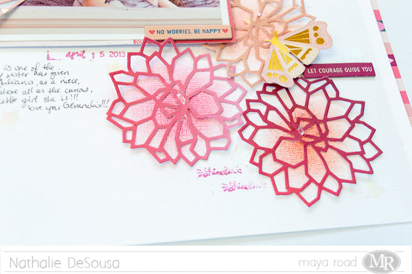
We have had such a long winter here in Canada that i think i have been dreaming my Spring season through my layouts.  So, this time i pulled the Geometric Blossom Die to cut a few flower cut outs from the beautiful Pick Me Up collection.


Before laying the flowers on the page, i added a bit of art crayon to the center of each flowers so that they stand out on the page.


What is Spring with out  a few butterflies.  This time, i used the With Love Nature Die Bundle to create a gold butterfly that is then nestled between some of the blossoms of the page.


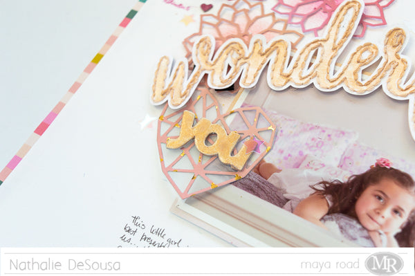
To create the title of this page, I  pulled a cut file from the Silhouette store, stitched it, and then used a bit of gold watercolor to pop it on the page.   Once the picture was set on the flowers, I added a Snow White Pretty Resin Bow  to the title just to add to the girly feel of this page.


To complete the title of this page, I pulled the word "YOU" from the Shot Through The Heart Chipboard set, and painted gold to match the title.  But before adding it to the page, i created a heart using the Geometric Heart Die from one of the papers from the Pick Me Up collection.   The heart and the chipboard piece were then added to the picture.


Finally i added a few star sequin to the page, and a few lines of journal to complete the page.  Love how it turned out, simple and monochrome but so Spring, and all using the beautiful Maya Road products.
As always you can contact me if you have questions on how this came together.
Til next time!


Maya Road products used:

Apr 24, 2018

It's Good To Be Home


Scrapbook Layout created for Scrapbook Nerd  -  IT'S GOOD TO BE HOME -


Hi there!

Today, I am up on the Scrapbook Nerd blog with a tutorial on how to create the background of this page.  There is always small 2x2in cut apart cards that are left behind in my papers, so what better way than to use them to create a grid for the background of a page.


The grid is just the starting point for this page, and after it all comes together rather fast and simple.   A few clusters at the corners of the pciture just helps to frame it and bring it forward.


The clusters are a great place to add all those fussy cut elements and the title of the page.  Also the grid can help to create the visual triangle of the page.


By repeating some of the elements in each of the clusters, the page becomes coherent, and the eye is guided along the entire page, too.  Here is the final layout:


A simple and colorful design for this page, where the picture shines completely.  Stop by the Scrapbook Nerd blog to see how the background was created.

XO,

Nathalie

Apr 23, 2018

I Am a Mom

Scrapbook Layout created for Simple Stories  - I AM A MOM -


Hello Simple Stories friends and fans!  Nathalie with you today with a new layout that speaks to my soul using the beautiful I AM collection. 


I don't know about you, but i can not get enough of all the florals in the I Am collection ( plus if you have seen my work before, then you know i am a sucker for florals!).  So what better way to showcase them than to fussy cut them and use them  as the focal point of a layout.


For this page, my idea was to have all the flowers as if they were wrapped around the picture.  So i cut a large strip of the 4x6 horizontal and 4x6 vertical elements and stitched them together, and then used a bit of cardstock to propped this on the center of the b side of the Walnut/Cream Dot paper from the Sn@p basics.


Then used some quality time with my detailing scissors just fussy cutting floral designs from a few of the papers from the collection and the 6x8 paper pad


Once i set the picture on the vertical strip of paper, a bit of foam adhesive was used to layer the florals and embellishments.  I tried my best to create the illusion of the flowers wrapping around the paper strip.


The butterflies help guide the eye across the layout which helped to add lots of small word stickers and ephemera that tell the story of the picture, "motherhood"


Finally the title was created using some of the Chipboard stickers, and the Sn@p Color Vibes Light letter stickers ( which match the tones in the florals).   A few stamped sentiments using the rotaty stamp complete this page.


I love this page, it tells the story of the past 18 years of my life.  Trust me, the I AM collection is perfect to create those unique stories about you, just the way you want to tell them.  So don't forget to check it at your scrapbooking store.

XOXO


Materials Used:
I AM collection:
10024 Collection kit
10036 4x6 horizontal elements
10037 4x6 vertical elements
10039  6x12 Chipboard stickers
10040  Bits and pieces
10041  Cardstock Stickers
10045 Roller Stamp

7059  Sn@p Color Vibe Lights Letter Stickers
2852  Sn@p Basics  Walnut /Cream dot 12x12 paper