Pages

Aug 31, 2018

Beautiful


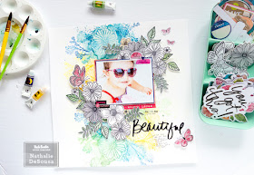
Scrapbook Layout created for Vicki Boutin DT   -  BEAUTIFUL  -


Hi there!

Hope you are all enjoying the last days of Summer (here in the North hemisphere)!  Today, I want to share this new page created using Vicki Boutin's new Field Notes collection.   I received the entire collection (one of the perks of being part of her design team)a few weeks ago, and fell in love with all of it.  The colors, designs, stencils and stamps are gorgeous and so versatile, You are going to love it all!!


To create this page, I decided to use a resist technique using Matte Acrylic gel and Vicki's watercolor set.   I started by prepping one of the foundation papers with a coat of gesso.  Then used a mixture of white art crayon and matte acrylic gel to create the flower impressions on the paper.  You are going to want two sets of the stencils, as they can be used as masks, too!


Once the impressions were completely dried, i used Vicki's watercolors to create a large watercolor background surrounding the flowers.  I made sure that the watercolor covered the groves inside the flower impression.  Before the watercolor completely dried, I used a baby wipe to buff the surface of the stenciled flowers, so that the whiteness of the acrylic gel will appear amongst the watercolor background.


Once the watercolor completely dried, i used the color wheels and one of Vicki's new stamps to add branches/leaves to the background.  I made sure to color block the stamped images to the corresponding color of the flower background.  I set the background aside for a bit so that all the inks completely set before building the layout.


While the background dried, i decided to use all of Vicki's stamp and die sets to create die cuts for my pages.   Also, I went ahead and chose matted and layered the picture of our Goddaughter with papers from the Field Notes 12x12 paper pad.


Once the picture was set on the layout, all the new stamped die cuts were used to create this large clusters at two corners of the picture.  I chose to keep all the flower die cuts white, add color to the stamped leaves, and also to bring some of the colors in the picture in the embellishment that will be used in the page.


By keeping the die cuts white, the added embellishments, from Vicki's new collection , become the perfect complement to the picture being documented.


I kept the rest of the page very simple, and opted to use one of the new thicker phrase stickers as a title, and then added a few more embellishments that will complement the colors in the picture.  Here is the final layout:


I love how this turned out.  The background color and design are perfect, and all the colors the ideal combination to make the picture of this page shine!  Love the contrast in colors and textures featured in this page.  The following video will give you a more detailed look at the creative process of this page:


As always do not hesitate to leave me a comment if you have questions on how this came together.  Remember to check Vicki's new collection, "Field Notes"; I am sure you are going to love it!!!

Til next time!


Materials Used:
Foundation Paper
Gesso
Watercolor set
watercolor brush set
Matte Acrylic gel
White art crayon
Warm and Neutral Art Crayon sets

Field Notes collection:
12x12 paper pad
Watercolor stickers
Puffy stickers
stamp and die set
stencil set
Black phrase thickers
Washi tape

All the Good Things collection:
cardstock stickers
Finishing elements


Aug 30, 2018

Boys Rule

Scrapbook Layout created for Sinple Stories  -  BOYS  RULE!!! -


Hi there, Nathalie with you today bringing you a new colorful and fun layout using the new Simple Stories "LIL' DUDE" collection.   This collection is filled with fun details for all those little boys and kids at heart, but my favorite thing is that it features a "Boston Terrier" design in it, and as a mom of a "Boston Terrier" baby, i cannot get enough of it (and might have to hoard quite a bit of it, too!)


To create the background of this page, I used a Just Nick cut file  to create all the stars from white cardstock, and backed them all with papers from the Lil' Dude collection


Since the Boy Oh Boy paper from the collection is being used as the background,  a little bit of white acrylic paint was used to mute the pattern under the stars.


Once the stars were set with a bit of foam adhesive,  the picture of my nephew with our baby Boston Terrier was backed and layered with papers from the Lil' Dude Collection, and nestled in between the star clusters.     I created clusters of ephemera at the corners of the picture using all the embellishments from the collection.  Love all the small details in each embellishment!


In addition, small clusters were also created around the background.   Some cardstock stickers and stickers from the 12x12 sticker combo sheet were combined to add more interest to the page>.


The large Chipboard sticker phrase was used to create the title of this page.  Love the addition of black in the Lil' Dude collection!


This page is all about fun and my little nephew, and i love how easy it was to combine all the elements in the Lil' Dude collection in this page!!!  Remember to check it out, I am sure you will love it!!

XO


Materials used:
10224   Collection Kit
10225   Sticker Combo Sheet
10226   Boys Rule
10227  Never Grow Up
10228  Boy Oh Boy
10232  No limits
10233   Play Hard
10234   2x2 elements
10235   3x4 elements
10236   4x4 elements
10237   2x6 elements
10238   Chipboard stickers
10239  Bits and pieces
10240   4x6 Cardstock stickers
10241  Puffy Stickers

Aug 27, 2018

Some Kind of Wonderful


Scrapbook Layout created for Scrapbook Nerd  - SOME KIND OF WONDERFUL -


Hi there!

It is time for a new project for Scrapbook Nerd.   I recently picked the entire Maggie Holmes Willow Lane collection from the store, and decided to use it to create this page all about my daughter and her love for her guitar.


I challenged myself to use a non-white background for this page, and decided to stamp a monochromatic background using the collection's stamp set.  To bring attention to the tone-on-tone stamping, I added a small clear Nuvo drop to the center of each of the flowers.


Next,  I cut a few of the papers from the 12x12 paper pad, and layered them on the right hand side of the page.  Love the gold embossed music sheet paper, as it works perfectly on this page.


Some of the floral images were fussy cut from the 12x12 and 6x8 paper pads.   Once i have backed the picture with papers from the collection, I used the fussy cut florals to create clusters at the corners of the picture.


There are so many embellishments to chose from in this collection.  I played with some of the die cuts and foam thickers to create the title for this page.  Then added some of  the rub ons to the picture, and around the clusters in the page.  After my lines of journal, here is the final layout:


Sometimes inspiration hits late at night, and so is this case of this layout!  I love how this turned out, even when the background is not white!!!.

Remember to stop by Scrapbook Nerd to check this and all the new collections available at the store. As always let me know if you have questions on how this came together.

XO


Aug 25, 2018


Scrapbook Layout created for Citrus Twist Kits  -  LOVE THIS LIFE -


Hi there,

It is the last week of August, which means a new kit from Citrus Twist Kits is about to be revealed (and has already landed at my doorstep!).  So, it is only fitting that i show you one last project using a few the August 2018, Perfectly Posh, kits.


The background for this page was created using the new Pinkfresh Studio liquid watercolor (available at Citrus Twiist Kits shop) and the new This is Life - Outdoor Adventures.  I wanted a very organic/rustic look for the background, so that it mirrors that of the picture.


To create the layers behind the picture, papers from both the add-on kit and Patterned paper kit were used.   


All the clusters were created using a combination of pieces from the Cut-apart sheet (available for free at Citrus Twist Kits), the chipboard stickers, tag pack from the add-on kit, as well as stickers from the embellishment kit.   All the sentiments surrounding the clusters come from the This is Life stamp set and the Outdoor Fun stamp.


To create the title, the watercolor of the background was repeated, and the camp image -from the This is Life stamp set- was added.   The Maggie Holmes sticker sheet included in the embellishment kit provides the small sentiment that creates the title.  Here is the final layout


Love how this turned out.  The color combo and all the interest in the background are the perfect complement to this picture of my husband and son.  The following video willl show you how this was put together:


Stop by Citrus Twist Kits to check all the kits and goodies available at the shop.   You can always contact me if you have questions on how this was put together.

XO


Aug 23, 2018

Love


Multi Media project created for Citrus Twist Kits  -  LOVE -


Hi there!


It is a busy day in my blog, but after two weeks away from social media, it is time to share some of  the last monthly projects.   This time I want to share with you a project created using Citrus Twist Kits' August 2018 Grace Box kit.  I got to work with this kit this month ( and Imight have subscribed to it , too!) and loved each project created with it.


Using the paint and stencil included in the kit, this background was created in just a few minutes.   The color of the paint works as the perfect background for the white die cuts.


A bit of white vellum behind the flowers brings opacity to them, and makes them pop of the page.  All the leaves/branches were also added to the cluster  and under the picture.


A bit of gold paint was added to the "love" die cut piece so that it stands off the page.  This serves as the title of the page. 


To finish the page, I added a few details using the highlighters included in the Grace Box, and more details using the kit's stamp set.  I also added some butterflies left from a previous project created with this kit.   To finish the layout, I added a bit of journaling and the entire Isaiah 41:10 verse below the title, as well as some gold ink droplets.  Here is the finished layout:


Love how this turned out!   and it was so easy to put together using just the box contents.  The following video will show you the process:


Thank you so much for joining me today.   Remember to check this month's Grace Box kit and all the other kits at Citrus Twist Kits. I am always a comment away if you have questions on how this came together.

XO


Home Sweet Home


Scrapbook Layout created for Scrapbook Nerd - HOME SWEET HOME -


Hi there!

It is theme week at Scrapbook Nerd, and we all were asked to create a project about our Summer Favorites.   Well, I chose to document my baby's favorite... Sitting in the living air conditioned living room!!!


Using  a Paige Evans cut file, and Amy Tangerine's Shine On collection, the backrgound was created.   A bit of foam adhesive helps adding dimension to this pretty light background.   The paper that serves as base for this page comes from Simple Stories High Style paper pad.


Using the Shine On collection, a few clusters were created around the large title.   I mixed a few stickers from Simple Stories Good Vibes collection, and a few stickers from Citrus twist Kits that are in my stash


To frame the picture, I created two clusters of ephemera, stickers and fussy cut pieces from the Shine On collection.    The colors in this collection are to die for!!!


A few lines of journal were hidden under the large title.   IF you know my work, then you know that large titles are my favorite, so this is a home run in my view!

Remember to stop by Scrapbook Nerd to check all the materials used in this page.   There are so many new goodies arriving at the store you don't want to miss.

As always I am a comment away if you have questions on how this came together.

XO


Aug 19, 2018

This Day


Scrapbook Layout created for Vicki Boutin DT  - THIS DAY -


Hi there!

The new Vicki Boutin collection has started shipping to stores around the world.  I am lucky to have received the entire collection a few days ago, and all I am going to say it is gorgeous, colorful and so fun!  Of course, i had to create a page with it as soon as it arrived to share with you all the beauty of this collection.


I started with a gesso foundation page, and then used some warm art crayons to create a watercolor look on the layout's background.


Once it dried,  the stencil brush and the the same crayons were used to create the circle impressions on the background.  The new stencils are so versatile, and so easy to  use to add layers to any page.


Using some black ink, and Vicki's new stamp set, i added details to the background.Once again the stamp was used to add a layer to the background.   The final background is the perfect starting point for the beautiful designs of the new FIELD NOTES collection.


I used the floral paper in the 12x12 paper pad to fussy cut a few of the images, so that i can cluster and layer them around the picture.


The B-sides of the 12x12 paper pad are the glorious complement to the fussy cut florals of this collection!  I used a few of the papers to layer behind the pictures and then set them in place on the page,


Love the new washi tapes included in this collection.  I have added a few pieces from it as bottom layers behind the pictures, and then used the floral images, puffy stickers, watercolor stickers and ephemera to complemet the pictures.


To finish this page, i added a simple title using the new Thickers that are included in this collection.  They are thin and black and perfect for layering!  Here is the final layout:


LOVE LOVE how this turned out!  the colors of the fussy cut images along with the mixed media background are the perfect combination.   Honestly, make sure you check and pick up Vicki's new Field Notes collection, it truly is gorgeous!!!

XO