Pages

Jul 30, 2018

Junque Journal - Week 4


Hello everyone!
Nathalie with you today to show you a few of the prompts from the Junque Journal challenge for week 4.  I have been having fun with the prompts, and I am loving how a few of Vicki’s products can be transformed into amazing backgrounds.  So, let’s get started:


CIRCLES…  who doesn’t love circles!  For this prompt, I used the Circle die and stamp set to emboss ( with white emboss powder)a few circles on a watercolor insert.  The same stamp was used to create a few black stamped circles. 


I used a combination of fuchsia and purple art crayon to add some color to each circle, making sure to add some shadows and contours to some of the circles.


Once the background dried, I went ahead and used the starburst circle stamp and the ink wheels to add a few more circles to the page.  Love the  color and composition of this entry!


STAMPING THROUGH A STENCIL…  This entry was created using the butterfly stencil two ways.  First, I used a pen to trace the butterflies onto some scrap cardstock and cut the shapes so that I could use it at a mask in the page.


Next, I used some washi tape to secure the stencil to one of the printed mixed media inserts.   Using  a few shades of blue art crayon and the small script stamp -from one of Vicki’s Stamp and Die sets- I added some stamped images to the paper through the empty spaces of the stencil.  A bit of extra pressure was used, as I wanted to make sure the stamp will reach the paper.


Once I removed the washi tape and stencil, I used the fussy cut images to cover the recently stamped butterflies.  Using the stencil brush and a yellow art crayon, I added the color to the background without changing the color inside the stamped butterflies.  This was fun to create!


BLACK BASE…  I have had this idea for the prompt since I read it in the list and was so excited to create it.   First, I covered one of the Kraft insert with black acrylic paint using a brayer.


To create the script impression, I used the white art crayon, stencil brush and script stencil.   The soft impression gives the look of writing on a blackboard. 


Next, I added the floral gold impression by using the flower stencil and some gold glaze.   The small butterfly sticker was also colored with some of the gold glaze.
Super loving how this page turned out.


DECOUPAGE…  Now this is probably one of my favorite pages for the week.   It all stated when I used some matte acrylic gel to glue pieces of Tim Holtz printed tissue.  A thin layer of the gel was then applied to the entire page, and set aside to dry,


I added lots of layers of art crayon to create a soft rainbow look to the entire page.  Then used the black crayon and stencil brush to add a soft shadow around the page.   I used a baby wipe to take away some of the art crayon through the flower stencil, and finally used the stencil brush and a Heidi Swapp stencil to add some details to the page.  LOVE how this turned out!
Just love how easy these were to put together, and the following video will show you a more-in-depth look of how some of the pages were created.


Remember you can contact me if you have questions on how these came together.  Remember to check all of Vicki’s amazing goodies and come join us in the community group on Facebook.

XO


Materials Used:
Junque Journal
Kraft, printed mixed media, watercolor and mixed media inserts for the Junque Journal
Gesso
Gold and rose gold glaze
Matte Acrylic gel
Waterbrushes, watercolor brushes, mister
Art Crayon – warm, cool and neutral set
Stencil – flower stencil,
Ink wheels
Circle Stamp set
Stencil brushes

Jul 25, 2018

I Love Summer


Scrapbook Layout created for Scrapbook Nerd - I LOVE SUMMER -


Hi there!

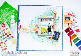
Hope you all are enjoying your summer/winter!...  Today's project is for Scrapbook Nerd, and it is all based on Summer, and its colors.


I started with some Vicki Boutin acrylic paint and gesso to create the colored triangle shape on the page.  Once it dried, i used some gess and a Kaisercraft stencil to create the spinwheel/firework image on the backgroud. The  background  was finished with some gold ink droplets.


I took advantage of the shape of the background to create a large cluster of ephemera, chipboard stickers, and  some paper layers along the vertical line of the picture.   I used all the colors in the new Echo Park  Good Day Sunshine collection to bring Summer to this picture of my daughter at the beach resort in Ecuador.


To accent the shape of the background,  the page was trimmed about half an inch per side, and then glued to one of the papers of the collection.   A small slit was created on the half point of the vertical side;  the edges were turned in, as to reveal a bit of the background.  The fold was then used to hung a banner that serves as the title of this page.


I love how this turned out. The colors and feel of the page are perfect for Summer, and the  picture of my daughter. 

Stop by Scrapbook Nerd to check all the materials used in this page, and remember that you can always contact me  if you have any questions on how this came together.

XO

Jul 20, 2018

Cool Rad Awesome Dude


Scrapbook Layout created for JustNick Studio  - COOL RAD AWESOME DUDE -


Hi there friends!

Nathalie with you today with a new layout all about my newly High School graduate (insert crying emoji here!).  I wanted to create something a bit different to document my son after graduating, so I searched the JustNick Studio store for the perfect cut files, and here is the result.


I wanted to create a large title that served as the background for the page, so I pulled the All Boy cut file to create the words in the title out of white cardstock.


Before laying down the title, i used a bit of Distress inks to add some mixed media on the background.   I wanted to play with the color of the graduating cap and my son's shirt.


While the background dried, the empty letter spaces in the cut out were backed using papers from the Pop Quiz collection from Bella Blvd.The colors are a perfect contrast to the background.


The title was attached to the background using different heights of foam adbesive, so that there is dimension on the layout.  Then just a few extra embellishments were neded to complete this page.


Love how this turned out.  The colors and large title are perfect for that picture of my son as a graduate.

Stop by the JustNick Studio store to checked the cut file and all of Nicole's lovely designs.   There are so many to chose from.

As always let me know if you have questions on how this turned out.

XO

Jul 19, 2018

My Personal Journal - Week 27


hello back!

Like I mentioned in the previous post,  it has been a rather busy couple of weeks.  Just a few more projects to complete before taking a small break to vacation in town with family from overseas. So without much further ado, here are the entries for week 27 in my personal journal:


These entries are a good representation of how busy my life has been, and the joy it is to create a visual journal to tell it.  A hybrid page (large title and backgrounds take the guessing game and take care of a lot of the embellishing on a page), a simple scrapbook page, and a scraplift, all simple ways to  get your stories told on a TN.  I have used mostly Citrus Twist Kits, and some In A Creative Bubble digitals to complete the pages.


I have combined some CTK kits with Altenew stamps to create these pages.   Love the clean look of the pages, and how beautifully they tell our story.


The flower paper used in the top entry is one of my favorites ever from Citrus Twist Kits, and though I consider hoarding it, I kept reminding myself that i need to use more of my supplies.  So i am taking my time to see ways into adding my stories using all the goodies i am safe keeping.

Well, that is all for me for today.   It is time to dive in back into video and picture editing, so I can continue sharing what i create with you all.

As always leave me a comment if you have questions on how this came together.

XO

My Personal Journal - Week 26


Hello there!

How busy is your life?!  Well, though it may seem that my life is pretty standard, I gotta admit that the past few weeks -and still going- have been jam packed, and a bit stressing.   There are so many projects that i am working on, as well as having to organize my house to receive family from overseas YAY!!   I think that though I have documented my days, I have had a hard time photographing it all, and then there is the editing!   Well, I took some time today to go through 2 of the past weeks, there are still another week to edit, and this week.  So without further ado, i will give you a peak at some of the entries in my personal journal.


Most of the entries were created using kits and stamps from Citrus Twist Kits.   I love how versatile the kits are, and how easy they are to combine. Plus their exclusives and stamps are perfect for this format.


Besides the July Marker page, all the entries were created with kits from CTK....   As always having the option of going hybrid for some entries just helps with documenting at a faster rate.   But overall, i am so happy to continue to keep a daily journal, and add an entry a day.  I hope you too are taking a few minutes to document the little things.

Well, let's just say see you in a bit, as the next week is coming up in the next post.

XO

Taking My Sweet Time


Scrapbook Layout created for Scrapbook Nerd  - TAKING MY SWEET TIME -


Hi there! It is time for my weekly inspiration for Scrapbook Nerd.  This time around I pulled the new Pinkfresh Studio Sweet and Simple collection to document an everyday picture of my little guy catching some zzz.


The background of this page was created on tbe b-side of one of the collection papers.   A bit of white acrylic paint, followed by some Distress Oxides yield the sky look of the page.


The cloud cut out comes from a cut file from Just Nick Studio, and the empty spaces were backed with papers from the collection.  A bit of foam adhesive creates that soft shadow, and helps to add movement to the page.


The picture was framed usingg embellishments from the collection, and the Let Your Heart Decide collection,  A bit  of gold colorshine and lines of journal complete this page:


Love the cleaniness of the page, and all the small details,   Those huge lemons slices are just perfect for summer.   Remember to check this new collection at Scrapbook Nerd, and do not hesitate to contact me if you have questions on how this was put together.