Pages

Feb 28, 2018

Be Fearless


Scrapbook Layout created for Vicki Boutin DT   - BE FEARLESS -


Hello there!

Welcome to my blog!  Today, I am bringing you a new project all about my wish for Spring to promptly arrive.  And what better way to welcome Spring than flowers and happy colors - all courtesy of Vicki Boutin's All The Good Things collection


The inspiration for this page comes from the floral paper in the All The Good Things collection.   All the colors in the flowers are exquisite and scream to be fussy cut. 


In order to pop the color of the flowers, a bit of mixed media was added to the background.  First the page was prepped with some gesso and a palette knife, so that there is a lot of texture on the page.  Next,  a cooler palette of art crayons was added to the background so that all the distress of the gesso application appeared as the color was added.   To add a bit more color to the page, a few scribbles of the Vicki Boutin crayons was added, since the page was prepped, these scribbles could easily be blended to the page by diluting the ink with a bit of water.


Once the background was dried, a Paige Evans cut file was added on top of the color background, as to create a layer for the picture.


A few of the florals were then cut and bundled at the corners of the picture, as well as the bottom left corner of the page.   A few more embellishments from the  All The Good Things collection were then added to complete the  clusters in the page.   The title for the page comes from the die cut pack, and summarizes the story of the picture.


To add  more details to the page, a few of the rub-ons and enamel dots were placed so that they bring shine and complete the look of the clusters in the page.   Finally, a few lines of journal were added, as well as some sentiments using the rotary stamp from the All the Good Things collection.   After a few gold ink splatters, the layout was finished.   To see a more in-depth look on how the page was created,  please enjoy the following video:


I love how this page looks, the floral motifs pop off the page, but the background also help to keep the harmonious look of the page.   I hope this inspires you.   Remember to check Vicki Boutin's products at your local scrapbook store.   The collection and mediums are superb.

As always let me know if you have questions on how this came together.

Take care,


materials used:
Patterned paper -  All the Good Things collectioon - Vicki Boutin, 7x10 paper pad, 12x12 paper pad
Embellishments - All the Goof Things collection - enamel dots, die cuts, rub ons, foam worda
cardstock -  Bazzil - Marshmallow
Mediums -  Vicki Boutin  - Art crayon in cool and warm palettes, markers, gesso
Mist - Heidi Swapp - color shine in Gold

Feb 27, 2018

My Personal Journal - Week 8


Hi there!

We are almost at the end of February!!!  Time is flying!   Are you still capturing and documenting all those little moments?   It can be difficult to make time for this, but trust me is so rewarding at the end of the day to put it down in paper.    Here are my entries for the past week:


Maybe i might be a bit biased, but the PL kits and stamps from Citrus Twist Kits are perfect for my type of documenting.     So this week, most entries are worked with PL kits from November - February. 


This entry created mostly with Vicki Boutin's All The Good Things collection and mediums .  After meeting her, and spending my weekend with her, all i can think was rainbows and happy!


I hope you all take the time to capture your everyday.  It is all worth it!!!


See you next week!!!

Oh So Happy


Scrapbook Layout created for Scrapbook Nerd  -  OH SO HAPPY  -


Hello  friends!   Hope you are ready to start a new month!   It seems like this year is flying by, and now we are ready to put the winter gear away, and start to see how Spring starts to pop around us. Today, i want to bring you a new layout that is fun, and colorful, but also showcases dimension without adding undesired bulk to the page.


 The new Crate Paper's Good Vibes collection is filled with vibrancy,  color and texture, so I wanted to take advantage of these to create a page that also creates the illusion of dimension without adding the bulk to the page.   The following video will show you a few tricks when combining chipboard pieces so that they don't add undesired bulk to the page:


   As you just saw in the video,   the key to creating this page is to trim the chipboard at so that they create the illusion of an intersection while adding dimension to the page.


 Once the chipboard frames were trimmed, the layout came together in a small amount of time.    A bit of mixed media just peeking behind the frames is enough to bring more color and interest to the page.


The beautiful embellishments and fun phrases were the perfect to complete this page!   The intersected frames not only create the background, but also create dimension to the page with just a few tricks.


 As always do not hesitate to contact me if you have further questions on the page.  Remember to stop by the Scrapbook Nerd on line store to pick all the materials used in this page, and lots of new collections being added daily!  


 Take care!


Materials Used:
Cardstock - Bazzill,  Marshmallow
Patterned Paper - Crate Paper - Good VIbes collection ( individual  papers and 6x6 paper pad) Embellishments  - Crate Paper - Good Vibes collection - chipboard stickers, cardstock stickers,  pom pom frames,  puffy foam word stickers
Inks - Ranger - Distress Oxides in Fossilized Amber, Peacock Feather, Worn Lipstick, Abandoned coral, Cracked Pistachio,  Blueprint;  Distress Ink in Fire Red Brick 
Mist - Heidi Swapp - colorshine in Gold Lame

Feb 26, 2018

Family Forever


Scrapbook Layout created for JustNick Studio  - FAMILY FOREVER  -


Hello!

Nathalie with you today.  Finally the weather seems to be changing here in my part of Canada, so I am preparing myself for a colorful Spring by bringing a clean, and kinda monochromatic layout created with a few  JustNick Studio cut files.


Once I saw the new Grandma's Napkins cut file, the idea for this soft monochromatic page came to my mind.   The soft background was created by welding two of the images together, and cutting it from white linen cardstock.  It was then glued straight to the dark blush background.


Next, the  Boho Florals cut file was used to cut the flowers that serve as clusters and decoration around the page.   Just the flowers were backed with a lighter tone of blush patterned paper from My Mind's Eye Blush collection, while the leaves were backed with white vellum, so that they remain soft and delicate.


To add more dimension to the larger floral, a second die cut was glued to the mat under it, and a bit of foam adhesive secure both floral motifs together.   The tile was then created by adding a few pieces from the collection to one of the floral cuts that is placed at the bottom of the page.


I love how this page turned out.  The soft blush tones of the florals contrast with the darker coral tones of the mat, and the white lace-like background.   The page took no time to put together once the background was created. 


Stop by the Just Nick Studio on line store to check all the cut files used in this page, and the many new designs available each week.  I am also a comment away if you have questions on how this came together,


Take care!

Feb 24, 2018

Crafty Girl


Scrapbook Layout created for Simple Stories  - CRAFTY GIRL -


Hi there!

I am up at the Simple Stories blog with the last project for the 2017-2018 DT term, and i wanted to use one of my favorite collections, CRAFTY GIRL, to document a picture of my daughter and her passion for crafting!


It all started with this background created using Vicki Boutin's markers on a gessoed surface.  I love the subtle rainbow that it created for the background.


Next it was all about creating the focal point of this page - a large title -.  For this i used the Cut Shoppe's cut file, and used vellum and papers from the collection to back all the empty spaces.


This collection is packed with so many awesome stickers, chipboard stickers and die cuts, that i had to combined in clusters around the page.


Finally, I added the picture of my daughter to the page, and added another cluster of ephemera to bring the eye to the picture, and to emphasize the sentiment of  the page.     To finish the page, I trimmed the background, and adhere it to one of the papers from the collection.  Here is the final layout:


The lines of journal will be added once it comes back to me from Creativation.   Once you see this paper collection, you will also want it to be part of your projects, so check Crafty Girl from Simple Stories.

Take care!

Feb 23, 2018

Happy Girls!


Scrapbook Layout created for Vicki Boutin DT   -  HAPPY GIRLS!  -


Hi there!  Nathalie with you today bringing you a bit of inspiration using the beautiful “All The Good Things” papers.   I love butterflies, and been wanting to use them to bring a sense of movement to a page.  


I chose to document a picture of my daughter and younger sister in a tender embrace, and decided to use happy warm tones to bring the memory to life. 
The background of the page was created on a prepped/gessoed Foundation paper using acrylic paint –Coral Macaroon- and art crayons ( warm set only) .  


The acrylic paint was diluted, and added to the paper using the packaging technique.  While the paint was still wet on the paper, a bit of art crayon was added so that it combined with the acrylic paint.  All the excess paint was soaked with paper towel, and then a new coat of art crayons was applied using one of Vicki’s water brushes; this time however, the diluted acrylic paint was used to spread the art crayons on the page.   Once I was happy with the look of the background, it was set aside to dry.


To create the butterflies, I pulled papers from both the 7x10 and 12x12 paper pads that  had a lot of warm tones in them.  There is so much to chose from in the All The Good Things Collection!   Using a 1.5in butterfly punch I created die cuts from the papers and some white vellum, and decided to stitch them together along the centerline of the image.


Once the background was dried, I started to put together the layout.  First I backed the picture with some of the beautiful Floral paper from the collection, and mounted on foam adhesive.  The butterflies were then glued to the background so that they are floating around the picture


The title of the page was then added to the opposite side of the picture using a combination of the glitter foam thickers and the alphas from the collection.   A few rub ons and butterflies complete the small cluster.


Finally a few more clusters were created around the picture.   A small tag from the frame die cuts pack, a phrase sticker, and a watercolor sticker (all from the collection) form the top cluster of the picture.  For the bottom cluster, I used a combination of cardstock stickers  that matched the colors of the butterflies.   To finish the page, I added a few stamped sentiments using the roller stamp ( love that little roller!) and some gold ink, a few lines of journal, and some gold ink splatters.


I hope you are inspired to pull all your Vicki Boutin products and create some magic for your next page.  Here is a small video that shows you how this page came together:


Let me know if you have questions on how this page came together.

XOXO


Materials Used
Mediums:
Foundation Paper
Water Brushes
Gesso
Acrylic Paint – Coral Macaroon
Art Crayons – Warm Set

All The Good Things Collection:
12x12 paper pad
7x10 paper pad
Die cut ephemera – Frames
Cardstock Stickers
Gold Glitter foam Thickers
Chipboard Alpha
Rub-ons
Roller Stamp
Watercolor Stickers

Feb 21, 2018

Gift Wrapping


Project created for Maya Road  - GIFT WRAPPING  -


Hi Roadies!

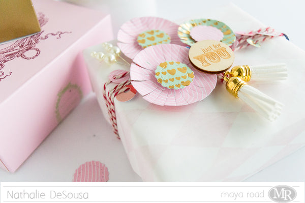
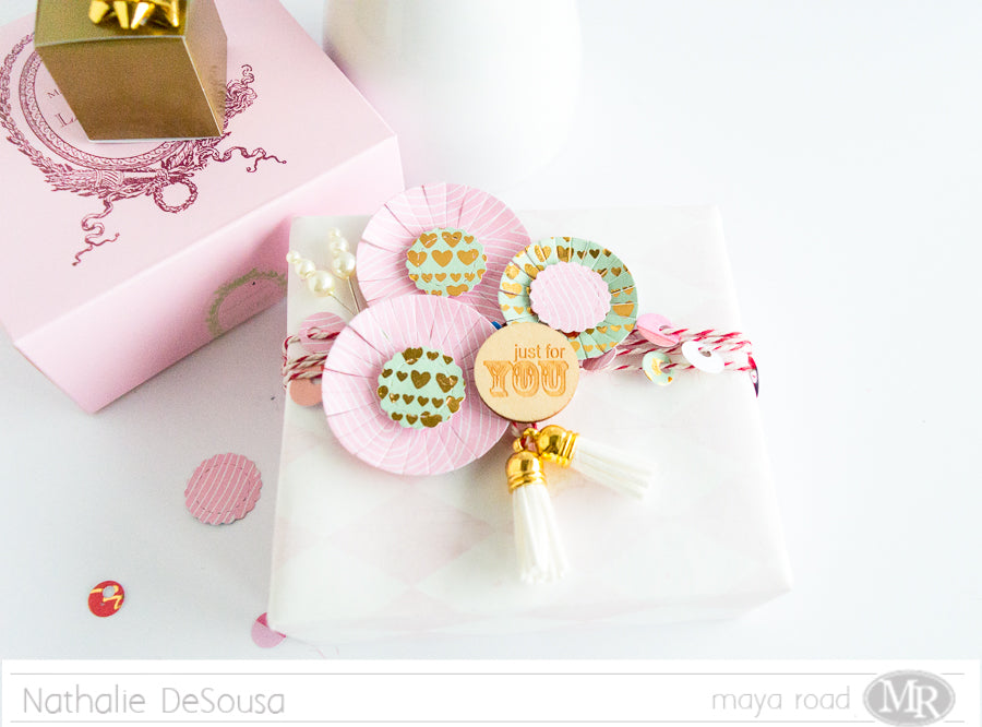
Nathalie with you today to bring you an idea of how to re-purpose the leftover Valentine's Day paper into a soft gift wrapping idea using a few Maya Road products.


I am sure some of you have a few pieces of paper left from your Valentine's Day craft session.  Fortunately one of my younger sister's birthday is on the 20th so it makes it easier to create the gift wrapping.


To create the wrapping, the Flower Die Set was used to obtain the flowers, its centers and a bit of paper sequin from Crate Paper's Main Squeeze collection.   A bit of foam adhesive creates a bit of dimension on each of the flowers' centers.


After wrapping the present; all the paper sequin die cuts were added to a long piece of Cherry Red Jute and Twine cord that was wrapped around the present.  All the sequin was set so that it only showed in the top part of the present.   A pair of Vintage Crafting Tassels (in Milk White) were tied to the center of the cord.


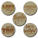
Next, a bit of foam adhesive secures the flowers to the package, and finally, a small wood token from the Wood Thoughtful Sentiments Token set was added above the tassels.   A few Vintage Pearl Trinket pins complete the packaging.


This idea took no time to put together, and it is the perfect way to jazz up simple present wrapping.  Who would not want to receive a present that looks so beautiful!!  Just imagine what it can contain!?!

Stop by the Maya Road online store to check all the materials used in this project.  Remember I am a comment away if you have questions on how this came together.


Materials used: