Pages

Jun 23, 2017

Summer Chill


Scrapbook Layout created for Maya Road   - SUMMER CHILL -


18951455_10213846628748334_9155030161043053618_n


Hello Roadies!

I am the one to wrap up the Maya Road & Simple Stories product swap.  I hope you all have been inspired by all the beautiful projects members of both design teams have been sharing this week.
I am lucky to serve as a member on both design teams, so this project was a dream to work on.   Today, I am bringing you a new layout that was completely inspired by the floral designs in the new Summer Days collection by Simple Stories.


The flowers in this collection resemble the ones from the  Maya Road Flower Die Set.   So i pulled some white texture card stock, and cut a few of the flower die cuts.  Since I wanted to make this page cheery and fun, I pulled the So Much Fun paper from the Summer Days collection to serve as the mat for this layout.


The color lines in the paper was the  starting point for the color blocking in the die cuts.  I simply used watercolors and inks to try (at best!) to replicate the colors of the paper lines in the die cut flowers, and leaves. To tie in the design, the centers of all the flowers were cut from the B side of the Lazy Days paper.


Once the picture of one of my littles was set in the center of the page, all the flowers were attached to the page following the color line they landed on.  Now it came time to decorate, and embellish!


I chose to add some wood tokens from the Wood Snapshot Token set, and the Wood 24/7 Journaling Tokens as centers in two of the flowers closest to the picture on each corner.  A Resin Diamond in Snow White as well a few Vintage Pearl - Trinket Pins were added around some of the flowers to bring the white color in the layout's mat.  


MR_ND_SUMMER CHILL prep-2


In addition, i used some of the papers and stickers from the collection to cover some pieces from the Mini Chipboard Heart Confetti Set and Love Chipboard Banner so that they also continue the colorful striped pattern in the layout papers.  A little bit of glue attaches the paper to the chipboard, then a bit of fussy cutting, and you can easily create new chipboard stickers for your projects.  These pieces were then used to frame the picture in the layout along with a few more stickers and paper pieces from the Simple Stories Summer Days collection.


I love the final look of this layout; lots of dimension and different textures bring the happiness of cheerfulness of a pool day on a hot day to the layout.  The Summer Days collection from Simple Stories is just beautiful, and our super versatile Maya Road products bring that special touch to this project.  They are a match made in "Craft" heaven!!

I hope you all have been inspired this week!  Don't forget to check the new Simple Stories  blog for more inspiration, and their new collections, and all the newly released Maya Road products (there are so many new goodies) available on line.  Remember I am comment away if you have questions on how this came together.

Thanks for Stopping by!

Nathalie-desousa-signature


Maya Road Products used:
Flower Die Set
Wood Snapshot Token Set
Wood  24/7 journaling Tokens
 Resin Diamond - Snow White
Trinket Pins - Vintage Pearl
Mini Chipboard Heart Confetti Set
Love Chipboard Banner

Materials used:
Simple Stories - Summer Day collection - papers, stickers, ephemera

Jun 22, 2017

Chilling TIme

Scrapbook layout created for Simple Stories  - CHILLING TIME -


Hello there!

Today I am up on the Simple Stories blog with some projects created for the Simple Stories & Maya Road product swap.  These projects were a dream to create since I am part of the creative team for both companies


My first layout is all about summer,  my daughter's fascination with ice cream floats, some of the Maya Road goodies,  and the super fun Summer Days collection.  The staring point for this layout was the "Lazy Days" paper in the collection.   The spin wheels in the paper was the inspiration for this layout.  So i set out to create a few spin wheel cut-outs using the Cut Shoppe's Spinwheels cut file.


The cut outs were backed using the Lazy Days, So Much Fun, Hello Sunshine, Gotta Wear Shades papers from the Summer Days collection.   The lovely  decorative brads were then used in the centers of each of the spinwheels.


To bring in the colors of the collection to the page, a few splatters of watercolor were used to create a mixed media background on the page.  Once this dried,  the page was trimmed on two of edges, as to continue the movement of the spinwheels, and then attached to the B side of the Lazy Days paper.  All the spinwheels were also glued to the page as if cascading from the top of the page.


And now to embellish the page.  First, I created clusters around the picture using some of the combo stickers, bits and pieces and 4x6 stickers from the collection.  The little mason jar sticker full of lemonade gave me the idea to create a mason jar of my own for this page.


Some white acrylic paint was used to add some color to one of  the  Maya Road Vintage Wood Mason Jar.  To pull more of the colors from the Summer Days collection, some water crayons were used to color the Medium Vintage Paper Flowers , and Ken Oliver's Small Vintage Paper flowers.  Once the wood jar was dried, a piece of Lime Green Jute Twine cording was wrapped around its neck, and all the flowers were then glued to the page.   I just love how the Maya Road products add that charming accent to the page!


To finish the page, the Alphas in the 4x6 stickers were used to create the title.  Oh! I really like the overall look of this page.  It is bright, happy and full of texture, in total a great fusion of both Simple Stories and Maya Road Products.


Materials Used:
Simple Stories - Summer Fun collection - paper kit, sticker combo, brads. ephemera
Simple Stories - Faith collection - Brads
The Cut Shoppe -  Spinwheelsl cut file
Ranger- Distress Oxides - Worn lipstick, Fossilized Amber, Cracked Pistachio, Broken Chine
Maya Road  - White  Vintage paper roses,  Mason jar wood piece, jute cording twine in lime  Ken Oliver's small vintage flowers

Jun 21, 2017

Love


Scrapbook Layout created for Simple Stories  - LOVE -


Hey there!

I am so excited for today's blog post at Simple Stories. For this week Simple Stories and Maya Road have joined forces to use their products. Since I am part of both creative teams, this was a feast!!


The new Hello Lovely collection has quickly become one of my favorite Simple Stories collections (this far!).  This time, I set to use it to document a picture of my nephew and my daughter -yeah!, i used pink for a boy layout, and the results are lovely-.


For this layout, I wanted to use as many of the patterns of the collection in one single page, so I pulled the Free Love cut file from Just Nick Studio to create the large title.  Each letter in the cut out was then backed with the So Very Lovely, Fab-YOU-lous, and the journaling cards from the collection.   Once all the cut outs were backed,  i chose the So Much Happiness paper from the Life in Color collection to serve as the layout's mat.


This picture of my daughter and nephew is one of my favorites, and so fitting for the title and feeling of the page.  The 4x6 cards from the cut-apart paper were used as layers behind the picture.   The floral designs of the collection are so beautiful, so I used some fussy cut flowers and stickers from the 6x12 sheet to create a large cluster around the picture.  The little key charm from Ken Oliver Vintage Heart and Key charm from Maya Road fits perfect in this little cluster.


The beautiful Maya Road Pink and Red Vintage Paper flowers  were used to create clusters at the corners of the title.  The colors in the flowers matched perfectly those of this collection.


  In addition, the Ken Oliver Heart and Key charm from Maya Road add hints of gold, and complement the look of the title and the page.  Finally, some pieces from the Faith collection Sticker combo were added around the page.  And as a final touch a few splatters of gold ink were added to the page, and to the Maya Road flowers.


I love the simplicity of this page, and  how the Hello Lovely can easily be used to create a boy layout.  I am sure you all will also love this collection.

Thanks for stopping by!

Materials Used:
Cut file  - Just Nick Studio
Simple Stories - Hey Lovely collection
Simple Stories - Faith collection - card stock stickers
Simple Stories - Life in Color -
Maya Road - paper flowers in red, pink
Maya Road - Ken Oliver's Vintage findings Charms - Lock and Key

Jun 20, 2017

You Float My Boat


Scrapbook Layout created for The Cut Shoppe  - YOU FLOAT MY BOAT -


Hello there!!

it is a sad day for me as this is my last post for The Cut Shoppe - the design team will end at the end of this month-.    It has been a pleasure to work with and for Ashley, to whom i will forever be thankful for taking a chance on me!.


At the same time, as this goes live, I will be packing our bags to take a month long vacation to beautiful Ecuador.  It is all about visiting my family, and creating memories like the one documented in this page.   This is actually one of our favorite pictures from our last trip 2 years ago, and my daughter, and her little cousin just loved being together, and this is an example that some traits are inherited.


As the picture was taken while sailing down the Amazon River, I chose to use the Nautical Notions cut file to recreate the scene,   A bit of mixed media created using Distress Oxides brings the colors of water to the page, and also enhances the helm image.


The helm of this layout was created from one of the papers from Ashley's "Ain't Life Grand" collection for Pretty Little Studio.  I also cut an offset image of the helm from white cardstock,and glued them together.   A bit of hand stitching brings all the details of the cut to the eye, as well as adds texture to the page.


The embellishments from this collection were perfect to create clusters around the picture and helm , hence creating a visual triangle.    Those flowers are just one of my favorites ever!


The title for the layout was also created from the cut file.   Once again,  i used one of the papers from the collection, and machine sewn it to the  page.   A small strip of blue vellum (cut to look like waves)was added to the bottom of the page.   After adding some enamel dots and ink splatters, here is the final layout:


The final layout is one of my favorites to date.  It is with heavy heart that i bid my farewell to the Cut Shoppe, but i am still a fan of Ashley's designs, so you will continue to see them in my pages.

Thanks for stopping by!


Materials Used:
Cut Files -  The Cut Shoppe

Patterned Paper collection and embellishments - Ain't Life Grand by Ashley Horton - Pretty Little Studio
Distress Oxides - Broken China, Faded Jeans - Ranger
White Enamel dots - Ranger

Jun 18, 2017

MY PERSONAL JOURNAL


Traveler's Notebook spread created for Clique Kits  -- MY PERSONAL JOURNAL --


Hello friends!


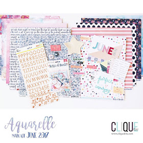
  i am back on the Clique Kits blog with a new entry to my personal journal (aka my TN) using pieces from the beautiful "Aquarelle" kit, and a few other goodies from the Clique Kits Store.     Most of you know that I keep a personal journal, which i use as my Project Life/ daily documenter method.  Though there is days that only writing appears on the page, there are those other times when you  need to include pictures.  I have kept a journal for a long time, so i am always trying to come up with new ideas for my entries - "Life is all about variety"-.  Here is one of the entries from a few weeks ago  after attending a 65th birthday party for a very good close friend of the family!


    Our friend Martha loves flowers, so i set to create  a background for the page using the  Daisy  Layering Stamp from Altenew -which i picked from the Clique Store-.   For these flowers, I pulled a few archival inks, as well as some Hampton Arts inks from my stash, and stamped the flowers on a lightweight watercolor paper cut to the size of my TN page.


   I tried my best to leave the center of the stamped page clear, so  the eye is drawn to the center of the page.  For this page, I pulled more goodies from the   Clique Store -you should really check all the goodies available for sale at the store- in this case i am using Pink Paislee's C'est La Vie Acetate letters, and the clear stickers to create the title of this page.  I paired them with some of the Aquarelle TN kit exclusive printables, and a piece of the branding  strip of the Wild at Heart collection papers.   I just love how the black in the title pops from the page.  


    Before gluing the page down to the TN, I cut a piece of vellum to fit the TN size, leaving about 3/4 in extra along the short side of the piece -the vellum measured 8x5 in for this spread-.  I marked with a bone folder the extra space of the vellum.  Before attaching it to the TN, i stitched one of the cards included in the Aquarelle TN kit, and added my sentiment.  Then glued the extra flap from the vellum piece to the TN, and added the stamped page on top of the vellum flap glued to the page.


   Before completely stitching the  card to the vellum, i added one of the stamped images - i created some extra flowers, and fussy cut them- , some of the large flower sequin from the May kit releases, and a few gold flower sequin from my stash.  I just love that little shaker pocket, and surprise as you turn the page.


    I took so many pictures of the celebration that day, but wanted to keep the focus of the page on Martha and her family ( we are very close friends of the entire familly), so I created a film strip of some of the pictures, layered a bit of the tissue paper that the kits come wrapped with, and glued it to the center of a piece of copy paper cut to the TN size.
 Here, all the rest of the fussy cut flowers were used to frame the picture strip.  I pulled one of the fabric labels from the Aquarelle kit  - i was lucky to receive the "Birthday Wishes" in my kit-, and one of the copper asterisks from the Alpha set.


    All Clique Kits are always loaded with lots of goodies that make their way to my stash, so i pulled some of the stickers from the Love Always kit  -which sold out-, and added them to one of the clusters of this page.

 I love how this spread came together (sorry no video this time!),  the beautiful stamped flowers worked perfect to document this lovely lady on her 65th birthday.    As always I am a comment away if you have questions on how this came together.

 See you all soon!


Materials used:
Clique kits - Aquarelle Kit main kit
Clique Kits - Aquarelle Kit TN kit
Clique Kits - Sorbet Kit sequin
Alternew - Layering Daisy Stamp
Ranger archival inks  -vibrant fuchsia, cactus flower-
Hampton Arts inks - Passion Pink, Fiji Nights sets
Crate Paper - Love Day collection - cardstock stickers

Jun 15, 2017

Beautiful - Love Yourself -


Scrapbook Layout created for Clique Kits  - BEAUTIFUL - Love Yourself- --


Hello there!

Today I am up on the Clique Kits blog with a new project that focuses on creating your own embellishments.  I am so in love with this month's Aquarelle kit, that i am trying to use every single piece of paper in the kit.  Here is a small video on how i created this layout, so sit back and enjoy!!


As you can see in the video, I had used pieces from both papers(that had the mint/light blue color in them), so I found  a way of combining them both to create the layout's mat.


The number of butterflies i would need for this layout was larger than the ones left in the patterned paper, so I doodle a butterfly, and used it to create a cut file.  Using my Silhouette cameo, a large number of the butterflies were cut.  Before taking them off the mat, i sprayed a light mist of mint and light blue  on them.


To create the look on the butterflies, I used some distress oxides, and a craft mat (but any ink and plastic wrap/acrylic block would work).  After stamping each color on the mat, i diluted them with water, making sure that each color formed droplets on the mat.  Then i started smooshing the butterflies onto the color droplets and left them to dry.   Once they were ready, I used a fine black precision pen to delineate the butterflies.   The seam on the paper gave me a guide as to where to place all the cut outs.


The title of the page was first attached to the bottom of the page, followed by picture at the top of the seam line. Next using foam adhesive and glue, I attached all the cut outs to the page.


The picture of my daughter and me is nicely framed at the top of the page by pieces from the kit's ephemera pack, and some Clique Kits exclusive printables. My journal lines were added to a piece from the fussy cut paper in the collection, and some gold ink, here is the final layout:


I hope this serves as inspiration to create your own embellishments.   I am obsessed with butterflies, so this page is just fulfilling my creative side of my brain.   Remember to check Clique Kits if you are interested on the kit, or to check what they are stocking on their shelves.

See you all soon!!


Materials Used:
Clique Kits - Aquarelle kit
Ink - Distress Oxides - Broken China, Faded Jeans, Worn Lipstick, Fossilized Amber, Cracked Pistachio, Orange Marmalade - Ranger

Jun 10, 2017

Dream Big


Scrapbook Layout created for Clique Kits   -  DREAM BIG  -


Hello there!

Today, I am pulling double duty on a few blogs.   This time, the project created is for  Clique Kits using the beautiful Aquarelle Kit.  I have loved working with this kit, as it features the gorgeous Wild at Heart collection by Cocoa Vanilla Studio.     I have created a small process video on how this page came together, so sit down and enjoy a super condensed process:


The background of this project was created using a few of the Prima Marketing watercolor palettes.  Though the orientation of the original design changed as the layout progress,  the colors in the background bring the project to life.


Using the Clique Kits's January 2016 exclusive cut file, some butterflies were cut from white cardstock and vellum;  the rest of the butterflies come from the Mariposa paper in the collection.   Each cut out was backed with vellum , and machine sewn into the layout.


Once the butterflies were in place, a cluster was created on the very top of the page.  This completes the path created by the background, and it is the start of the visual triangle on this page.


I love to keep track of the kids development using a fixed object.  This time both my niece and daughter purchased the same bracelet.  "DREAM BIG" is what is spelled by the beads, so i chose to photograph their development using the bracelet as the focus point.   To bring the photograph to focus, just a few pieces from the collection, and exclusive printables were used in clusters around the page.


Finally, the title of this page was created using the copper Alphas from Pinkfresh Studio that are included in the kit.   After a few more small details, and a few journal lines, here is the final layout:


It is the simplicity of this page that is so attracting to me, not to mention is full of butterflies -one of my favorite things, ever-.   Remember to visit Clique Kits for the kits, cut files and exclusives used in this page.

I am always a comment away if you have questions on how this came together.

Thanks for stopping by today!


Materials Used:
Clique Kits - Aquarelle Kit

Clique Kits - cut file -

Prima Marketing - watercolor palettes - The Classics, Pastel Dreams, The Tropicals
Clique Kits - Digital Printables - September 2015