Pages

Mar 31, 2016

Sweet Joy


Scrapbook Layout - Sweet Joy -


A close up of the layout...

Hello everyone,

I have been putting my creativity to good use this week.   I have so many beautiful pictures to document, and not enough time in the day...  

This particular picture is a favorite of my entire family, as it is my youngest sister (she has autism, so she socializes differently than the average teenager) leaning on my husband shoulder and actually smiling for the camera - A miracle on both sides!!-.  

 I have been meaning to dust off my mixed media skills, so I channeled my inner artist for this layout.  I started by adding splashes of shimmering pink and mint watercolor on some white cardstock. I was drawn to  a cross pattern for all the splashes of color.


the lack of gesso caused the paper to buckle a bit during the process.


Once the color splashes had dried, I added a few stamped hearts -i used black ink to create some contrast-.  To add texture,  I use a polka dot stencil with white shimmer paste just on the outer corners of the cross pattern.


A close-up of  the mixed media details.


While the paste dried, I went ahead and started working on building the layers for the picture.  I used papers from Craft Smith's Mint and Pink collection from Michaels. 


I added a gold acetate 6x4 card as the mat for the paper layers.


Another look at the layers  of  the layout...


Using staples adds dimension to the layers


For part of my title i used some water color paper to cut a banner using my Silhouette Cameo.  The Joy banner comes from Paper Issues.  Once I cut it, I used gold acrylic paint to add shine to the banner.


I chose to enlarge the banner to be the same size as the paper cluster...


Once all the  parts were ready,  I went ahead and printed the picture in black and white ( this way it creates a lot of contrast to the rest of the layout).  And started assembling the page.


A side look of the paper cluster


To complete the title I used a cut-out from All Gold Things collection from MME at the top of the picture.  This also helps to balance the  large banner at the bottom of the page, and frames the picture at the same time.


A scalloped tag on the background softens the straight edges of the paper cluster.


Finally  I added a few sequins and some star shaped confetti to complete the piece..
I am so pleased with the end result. I hope you like it, too.

See you soon

P.S.  Remember April is Autism Awareness Month, i would invite you to get some information on how this chromosomal disability can affect kids and adults and their families.  We love our little sister, and her disability -autism- is one of the biggest blessings our family ever received.


The completed layout...


Materials used:
Cut file -Joy Banner-,  Paper Issues.com
Banner cut-out,  water color paper
Gold Acrylic paint, Heidi Swapp Marquee Collection
Patterned Paper,  Mint and Pink collection, Craft Smith, Michaels
Ephemera and title, All things gold collection, My Mind's Eye
Shimmer water color,  Artist Loft, Michaels
Mint and Pink Color shine, Heidi Swapp
Heart stamp, Recollections, Michaels
White screen paste, Heidi Swapp collection
Polka dot Stencil, Heidi Swapp Collection
Tag,  Recollections,  Michaels


Mar 30, 2016

Unique Spirit


Scrapbook Layout - Unique Spirit -


Hello Everyone!,

April is  Autism Awareness month, this is a cause very close to our hearts as my youngest sister was diagnosed with autism at age 2.  After many years of therapy, patience and much love she is able to communicate with us and live a "normal life".  I have to say that my dad and his wife have done a tremendous job trying to make sure she enjoys life to the fullest; she is now turning 19 in a couple weeks, and is ready to go on her high school graduation trip to New York for  her b-day.

To us, Michelle radiates innocence, sincerity and much, much love.    So how do you capture that in a layout?  My answer color... Since the sign for autism is a puzzle piece, i opted for using a puzzle background  cut-file from the Silhouette Store, and backing every puzzle piece in a different colorful paper from the Jubilee collection from My MInd's Eye.


The details of the top right corner of the layout...


I printed the picture in black and white to make sure it was highlighted in this sea of color...  I used some of the same papers to mat and layer the picture.  A few pieces of ephemera and stickers were all that was needed to bring some attention to the piece


I introduced wood details to add more texture to the layout.


I added my journal lines inside one of the puzzle pieces, and added a few details along the layout in order to balance the layout.  I love the results, but most of all I enjoyed seeing the piece come together.  I am sure she will love it, as she loves color...


The finished layout...


Before I leave, I would like to invite you all to read about autism, and how these children interact with the world.  Autism can present differently in each child it affects, as it has a very wide behavioral spectrum.  Once you inform yourself about autism, you will understand that these souls are just like you and me, the only difference is how they process information and relate it back to you.  In our case, Michelle is a blessing in disguise that teaches us all about unconditional love, patience and the power of GOD's love.

See you soon...


Material Used:
Cut file, Silhouette store
Patterned paper, Jubilee Collection, My Mind's Eye
Ephemera, Stitched collection, Amy Tangerine
Chipboard stickers,  Jubilee Collection, My Mind's Eye
Title - foam letters-, Thickers
Wood veneer shapes and words,  Recollection, Michaels


Mar 29, 2016

Love This Life


Scrapbook Layout  - Love This Life -


Hello all!,

we are almost done with our complete spring/house cleaning; so there is lot of time to scrapbook and document memories... There are quite a large amount of pictures sitting in my file that are worthy of  a beautiful layout...  So i will be busy for the next few nights and days...

This was the starting point for the layout


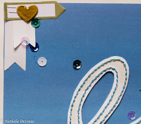
This layout started with a different idea in mind, and transformed as it progressed.  At first I used a free cut-file from www. lovepapercrafts.com  to form the title.  I wanted a bold and large title so I used 3/4 of the page when sending it to the Silhouette Cameo to be perforated...  I then used 3 different shades of blue thread to stitch each word respectively.  


A light coat of white color shine to the inside of the letters gives them a bit of spark.


Here is when I change my design, and opted to cut out the letters and attached them to a blue ombre paper.  Once i had place the title, I went ahead and pull a picture of my baby chewing on his blue disk.  I layered lots of paper in white, blue and green patterns to add some lift and create a frame for the picture.


Most of the ephemera was pieces from Heidi Swapp's MInc collections that
were foiled with blue and teal foil.


A few tags and stickers added interest to the piece.  I tied in the stitching theme with a little bundles of thread at the corners of the picture.  Since the page needed some balance, I added a few banners and a simple tag with to the top left corner of the layout.


The banners are made up from the backing pieces of the journaling label
used in this layout


I added  sequins in different shades of white, teal and blue to complete the page.
  I hope you like it as much as I do...   See you soon!!


The completed layout


Materials used:
cut file - title -,  "Love This Life",  www.lovepapercrafts.com
Patterned paper,  Recollections,  Michaels
Chipboard ephemera,  Heidi Swapp's MInc collections
Labels,  Freckled Fawn.


Mar 28, 2016

Project Life Week # 12


PL Week 12


hello everyone,

We have just celebrated Easter, and spring is rapidly coming.  Fortunately, I keep on documenting along with the season changes and holidays.  Here is my Project Life layout for this past week.


This small page protector works perfectly
to add pictures to a weekly layout


As always, when the holidays roll around, family always comes together and memories are created.  I had so many pictures to chose from this week, so i printed them in black and white so that I could use a pastel palette for all the cards used.


Some of the cards come from cut-apart patterned papers from different collections


Whenever I purchase a new paper collection, I try to get a double sheet of the cut-apart page, this way I can always use them in my PL layouts.   All the pastel cards come from different collections:  Dear Lizzy's Serendipity collection, Amy Tangerine's Stitched collection, Kaiser Craft's Blackberry collection, and Dear Lizzy's Neapolitan Project Life collection.


Here is the first two pages of the past week..


This week, I used a third page to document our Easter Sunday.  For this layout, I used an old patterned paper for My Mind's Eye from my stash, and cut it into the 3x4 card size.  I enlarged one of my favorite pictures of the day, and used it as the center image for the page....  I love the results, and might start to use this format for at least one of the monthly layouts...


I love the color  of the paper, and some simple embelishment were enough to complete the page...


I hope you are also documenting your life... See you soon...


My Week in Pictures # 12


My littlest one, always ready to pose for my lens...


Hello everyone,

I hope you all took the time to reflect on Christ's Resurrection on this Easter weekend.   I am a firm believer that our God-given lives are just the beginning of the true reward that is awaiting for us when our Saviour comes again. It is because of Christ that we have these blessed lives full of love and peace, and the best way to celebrate it is by capturing it, and sharing it.  

Since holidays mean family, there are over 500 pictures to chose from this week, here are some of my favorites:


  My nephew is never still, he just turned 3, and never stops.  He doesn't like to smile for the camera, so I have to catch him with my lens  in burst mode.  This is one of my personal favorites, as he looks so beautiful looking up at my mom.


My niece loves to pose for the camera, but i like to catch her when she is not expecting it.  Here she is playing with her toys on the dining room table.  The window light reflects her innocence so perfectly...


My sister is such a loving person, and she always demonstrates it with smiles and warm hugs.  She also loves to smile for the camera, and is always ready to pose for me -trust me I have lots of beautiful shots of her-.  I love catching glimpses of her motherhood...


She is trying to put my nephew to nap...


As always my kids are my best models, even when they are going through the no-smiling for the camera stage.  At the end,  they can always  be bribed, or i just shoot hoping for a great shot.  


It is amazing to see my daughter bloom into a beautiful young woman in front of my eyes.  She is my little girl always...


My son is rapidly becoming a man.  I am glad that even when he turns his head at the sight of the camera, I take the shots anyways.  He will thank me later in life...


Finally the weather is changing here... so for Easter we went on a long walk around our neighborhood (we are lucky to live next to a river path).  Here is one of the perks of having a beautiful day, scenery and a great family...


Crossing the Humber River...


Finally,  I was glad my people stopped to pose for me.  I used the bridge as a background for their beautiful faces...


I love this three, and the fur baby who wanted to come home to play with his new found stick...


I hope that you are taking the time to capture your everyday... 

See you soon..


Mar 23, 2016

Choose Joy


Scrapbook layout  - Choose Joy -


Hello everyone,

It has been a while since i have posted one of my current layouts on my blog.  It is not that i have not been scrapbooking, but I am designing for Scrapbook Nerd and Quirky Bits-N-Pieces for reminder of the year, so I have been busy creating projects for them... Soon I will be posting them...

As always i have a folder full of pictures to scrapbook,  this one is a favorite.  As always my daughter and niece posing for the camera, but in this one they recruited my sister, too.  Since I wanted to keep it girly and fun,  I chose pastel colors and this beautiful cut file from Studio Calico (Camelot XO).


Only some of the cuts are folded and glued to the mat.
The shadow that the cut produces adds dimension to the layout.


I chose this beautiful purple Marble paper from Mambi's Love collection to create the cut-out, and backed all the cuts with MME papers from older collections.  I like printing my pictures in black and white, as it helps with the colors and it brings them out  on layouts.  


The title came from an old chipboard sticker page.
Since the background is rather busy, I chose to add my journal inside of the cutout pieces


Since I have a rather busy background, i chose just a large cluster of embelishments for the picture.  I tried to combine the different pieces with the colors of the layout.  So I picked from different sticker collections.


I love to keep cards, little envelopes, etc.; the purple tag is one of this year's
Valentine's Day cards from Starbucks...   Let's just say I am a good customer...


Finally i just added a few chipboard stickers around the cut-outs and a few drops of purple smooch spritz...  I love the colors, the cut file and the picture; together they make the perfect combo... I hope you like it too..

See you soon..


The finished layout...


Materials Used:

Cut file,  Camelot XO, Studio Calico
Pattern paper -main cut-out- , Love collection, MAMBI
Pattern paper -cut-out backing-, My Mind's Eye
Title - chipoard sticker -,  Recollections, Michaels
Hear Tag - Valentine's Day Gift Card - Starbucks
Ephemera -Circle "Hi"-,  MInc collection, Heidi Swapp
Chipboard Stickers, Mambi collections
Chipboard sticker -arrow- ,  Wonder collection, Crate Paper
Label,  Maggie Holmes collection, Crate Paper
Ink splatters - Frosted Grape, Smooch Spritz.


Mar 21, 2016

Project Life Week 11


PL  Week # 11


Hello everyone, i am so glad March Break is over here in Canada.  Our week was not a good one by far -it went from a kid and a dog in bed for days to having my main bathroom remodeled-.  Through it all I managed to photograph my everyday, even when our plans were dropped...  Here  is my album entry for the the week


My two page spread...


I discovered this smaller pages at my local craft store this week, and they work beautifully for weeks with a few pictures...  I used a variety of cards from different kits and puffy stickers to give my pictures some dimension...


A  close up of the puffy stickers.


I hope you are also documenting your life.... See you soon...


Mar 20, 2016

My week in pictures #11


My Ode to March -Spring- Break...


Hello everyone,  it has been a rather interesting week in my household...

March Break came and went in a heartbeat,but left us with many memories good and bad to capture and document..


My Little one got a cut in his little paw, so he was not able to be his hyper self, and spent a lot of time on the sofa or in his siblings arms.


My son also spent the entire week in bed (in our case on the sofa) with a severe cold.  Thank God for March Madness to keep him awake.  So here are both my boys keeping each other company in the "sickness sofa"...


Since i spent a lot of time dealing with sick kids,  we limited our outings, so no pictures of outdoors, instead i took the time to photograph the little things that make my days...


My fruit snacks ... I love food photography


My St. Patrick's Day picture -once again i chose food to put my message across-...


Some breakfast cereal full of leprechaun hats and shamrocks..


And finally the weekend came by, and we were running around.  Here is a look at how we welcomed Spring from my bedroom window.


Weston Golf Course seen from my bedroom window...


Finally my daughter's ode to going back to school... It has been a hard week for her as we spent most of the time indoors and used the time to spring clean...


She is leaping for joy with the cleaning behind her...


Sometimes the best laid plans can get spoiled without any warnings.  This week is the perfect example of how things can change on a snap of fingers.  Through it all, my camera was there to capture the small details.  I hope you are taking the time to take small glimpses of your life, too...

See you soon..


Mar 14, 2016

Project Life Week 10


PL  Week 10


We are already at week 11 on our calendar, that means time to update on the past week (#10) on my Project Life album...

This week, most of the pictures were of different colors, so it was hard to find a unified theme.  Since we are in March which is usually represented by pastels and green,  I chose something in between and went with a teal color scheme to the layout.


I used papers from Pink Paislee to create the cards form the small pictures
in the 4x4 pockets


I found these 4x4 Heidi Swapp collection cards in my stash, and they helped to tie in the layout.  The 3x4 cards come from Dear Lizzy collection, and a Simple Stories Snap collection.  I love adding word stickers on to the pictures.  I am currently loving the Mambi collection.

For the Second page of the layout, i used many cards from old project life collections. I loved the cut-out cards, and they worked beautifully on this page.


Loving the soft teal color on the layout


Once again, i left a lot of empty space on some of the cards.   I like how it looks, and hope to keep them like that after I have added next week's cards.  I hope you are also documenting your life...  See you soon.


the complete week's layout


Mar 13, 2016

My Week In Pictures #10

The view from our balcony... Toronto at night


Hello Everyone,

It is time to highlight the best pictures of the week.  Since this week was personal week in the Capture Your 365 photo-a-day challenge,  most of the pictures this week reflect a side of me.


Gaining confidence with the camera  helps a lot when you are a self-critic.  Knowing how to work the light and process the picture give you a sense of confidence to stand in front of a mirror.


Sometimes considering angles allows you to compose a picture that depicts one of your favourite things as well as your mood for the day.   Here are my favorite boots...


Taking a  self portrait a day for a week, makes you find inventive ways to show yourself and all the world around you.   Like  when you are embarking in a better-diet mission...


There is no need to show my face to present the action.


or working on a daily chore...


and/or enjoying a good book in your leisure time


Photography can easily capture those fleeting glimpses of the mundane that sometimes we all forget...

I hope that you are a bit inspired to pick up your camera and go out and capture your life.


See you soon...